Tuesday, November 24, 2009

Lab Assignment #8: Census 2000/2010

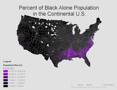
This map shows the percent of the population of African Americans or "Black Alone" race in the continental United States. From the color scheme on the map and in the legend, the map shows that there is up to 84.642190% of certain populations in the Southeast regions of the US that are African American. This is shown in bright purple. In many other parts of the US there is as little as 0.010289% of the population that is African American. The spaces that are white are places that don't have information on the percent of African Americans or the data is unclear.
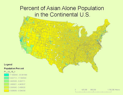

This map shows the percent of Asians in certain areas in the continental US or the “Asian Alone” population. The color scheme in this map and legend show that in green areas there is up to 35.991995% of Asians in certain populations and as little as 0.008506% in other populations. The areas in green show that there are the densest populations of Asians in areas surrounding Los Angeles, Seattle and New York.
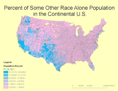

This map shows the percent of an unknown race or “Some Other Race Alone” across the continental US. The blue to pink in the legend shows that there are as many as 39.059829% of “Some Other Race Alone” in certain areas in the continental US and as few as 0.007950% in other places. The areas with the largest population are in blue and the smallest are pink.

Compared to the African American population the populations with the most Asians are much less dense then the populations with the largest number of African Americans. There are smaller populations of Asians across the entire US but larger populations of African Americans and the unnamed race in major areas such as the South and the Southwest. Compared to the percentages of African Americans and Asians, there are very close to the same percentages of Asians and the unnamed race and both are much smaller then the percentages of African Americans. The unnamed race is similar the percentages of African Americans in that the populations are the largest in a confined area. According to the large number of the unnamed race in mainly Southwestern regions, it can be assumed that the unknown race is Hispanic or Latino. From the maps above it is impossible to tell how many of both populations there are but comparisons can be made between how dense a population is and how dense an area is.


From the labs we have completed this quarter and the lectures we have attended I feel like I have a fairly good grasp of what GIS is and its applications. While most of what we learned doesn’t hold much real life value for me, I can see how someone pursuing geography would find GIS applications very useful in the field. After using ArcGIS for many labs I can seen how the visualization of geography can help to really demonstrate data in creative ways that help to better represent the information provided. Although I don’t plan on continuing in GIS I enjoyed taking this class and feel like what I learned was of value and helped me to better understand and appreciate maps and geography.


Monday, November 23, 2009

Lab Assignment #7: Mapping the Station Fire in ArcGIS


The LA County station fire took place this summer starting on August 26th and is recorded to be one of the 10 largest fires in southern California since 1933. It took place in the Angeles National forest and is now 100% contained although at the peak of the flames 2 firefighters were killed and 22 people injured in total (LA County Fire). The Angeles National Forest will be closed until further notice to give the area time to heal after such a devastating blaze (InciWeb).

For my assignment I included a reference map of the station fire which shows the spread of the fire according to the date in which the perimeter was recording. In order to show the spread of the fire I moved the first recorded perimeter which was on August 28th to the back so that the spread can be more easily seen. Each color corresponds to a recorded perimeter. This way it can be clearly seen that from August 29th to September 2nd the fire grew (LA County Enterprise GIS).

The only discrepency in the reference map of the station fire perimeter is between August 28th and August 29th in which the fire seems to significantly shrink. This may be due to mislabeled data since it is unlikely that such a large fire shrunk so much in 12 to 24 hours. The other map I included is a map of the station fire spread within a map of LA county so the area of the fire is better represented. Although there are no roads, cities or landmarks, the large area of the fire can be easily located within the Los Angeles area.

The other map I included is a thematic map of LA county which shows the outline of the two largest perimeters of the station fire in relation to cities, roads, interstates and largely populated areas within LA county. According to the information on the map, the cities and populations most affected by the fire are La Crescenta, La Canada and Altadena (NACO), because they are the cities closest to the largest perimeter of the fire. The major cities most likely affected were Burbank, Glendale and Pasedena. According to the map anything near the 210 interstate was also at risk because of the close proximity to the fire perimeter. One problem with the information on the map is that the cities are small dots to signify the center of the city but not the general area. The cities also have no labels to show which areas were affected. That is why I included densely populated areas on my map to be able to better see the city limits that were affected by the fire (UCLA MapShare).

The blue areas on the map are the most largely populated areas in LA county. As you can see most of these areas surround cities. Populations affected that aren't within the densely populated areas were no doubt truckers and those who commute through the affected area on the two major roads that run through the fire perimeter. Any detour would be long and out of the way. Luckily although also unfortunately, the fire took place within a national forest which is a mostly unpopulated area which is why only a few cities were affected.

Works Cited

1. Los Angeles County Enterprise GIS: Geospatial Technology for the Citizens of Los Angeles County
(http://gis.lacounty.gov/eGIS/)
Accessed: November 17, 2009

2. UCLA Mapshare: GIS at UCLA
(http://gis.ats.ucla.edu)
Accessed: November 17, 2009

3. InciWeb The Incident Information System
(http://inciweb.org/incident/1856/)
Accessed: November 23rd, 2009

4. NACO: National Association of Counties
(http://www.naco.org)
Accessed: November 23rd, 2009

5. LA County Fire: The Unofficial Site
(http://www.lacountyfire.com)

Monday, November 16, 2009

Lab Assignment #6: DEMs in ArcGIS


For my area of reference I chose to look at Mt. Rainier in Washington. As the biggest mountain in Washington I chose it because it is a clear landmark in the state and a location I am familiar. It is very obvious from a bird's eye view of Washington that Mt. Rainer is the highest point, although the 3D model seems to over exaggerate the elevation.
The extention information is as follows:
Visable Extent:
Left: -122.076
Right: -121.444
Top: 47.074
Bottom: 46.639

Full Extent: Left: -3.510
Right: -0.437
Top: 11.438
Bottom: 12.010

Wednesday, November 4, 2009

Lab Assignment #5: More ArcGIS


Lab Assignment #4: ArcMap

My experience with ArcMap was at times difficult but overall successful. With the detailed instructions it was very straightforward and at times simple. I am not generally a science or math geared person but I like when things are very formulaic and so when it was going well, ArcMap worked out very well for me. If I needed it or every decided to get into geography after this class, I could see it as a very helpful tool. It also made me want to do tutorials on all of the office tools I have on my computer because I'm pretty sure I don't know how to use most of their functions after seeing the many different functions of ArcMap.

The issues I had with ArcMap were at times finding the location of things I was supposed to open, basically only because I looked in the wrong places. When I messed up on one of the maps and went to my last saved map I had issues because one of the steps that I had gone on to before I messed up hadn't completely gone away so there were two locations that came up with I used the edit tool. I tried both of them and figured out which one worked and it ended up being fine. I am very glad I saved my work often otherwise I would have been quite frustrated at having to start over.

One of the biggest disadvantages of ArcMap is that it is not very user friendly. Although the tutorial was mostly very clear and easy to follow, as I explained if a mistake is made it is sometimes difficult to figure out how to fix as the tutorial doesn't tell you exactly how to back track if a problem occurs. Without at tutorial I can't imagine anyone except professional geographers being able to figure out how to use it. Unlike googlemaps it isn't very accessible. It is also a program that isn't available to the public which is another disadvantage.

While ArcMap might not be user friendly or universally accessible, it is much more detailed and has a lot more function then public access mapping. It has much more real world usage then google maps because it functions as an way to analyze information and maps. It is also very useful when relating data because of the ability to overlay maps an analyze the relationships. While ArcMap has many potentials and pitfalls, it is an important tool and will possibly eventually be as universal as google maps.

Monday, October 19, 2009

Lab Assignment #3: Neogeography


View Neogeography-Seattle Bridges in a larger map

There are many advantages and disadvantages of Neogeography. When completing an assignment such as this, it is convenient to use a free program such as My Google Maps and it is generally simple for those who have little or no experience in Neogeography. With this type of access, it allows people to be creative and to an extent without having to know much about the technology. Neogeography is now a way for the public to be able to share information that otherwise would be more difficult through free digital mapping. With the information on the internet today, almost anything is possible with Neogeography.

Although the internet broadens creativity and Neogeography helpd public access, one of the dangers is the lack of privacy that goes with this simple access. Online mapping sources also have their constraints; because they are so simple, there can be limits to what you are able to do and technical problems that the general public aren't educated in to be able to solve. Like anything, there are advantages and pitfalls but hopefully with time and with technology always advancing, the advantages will weigh out the disadvantages and all forms of GIS will be available to all.

Tuesday, October 6, 2009

Lab Assignment #2: The 7.5 Minute Map

1. Beverly Hills Quadrangle
2.Canoga Park, Van Nuys, Burbank, Topanga, Hollywood, Venice, Inglewood
3.1966
4.NAD 27, NAD 83
5.1/24000
6.
a) 1,200m
b)1.89miles
c)2.64inches
d) 12.5 cm
7. 20 Feet
8.
a)Lat: 34°04'24"N, 34.073°N Long:118°25'52"W, 118.06°W
b)Lat: 34°25'48"N, 34.43°N Long: 118°07'15", 118.41°W
c)Lat: 34°07'10"N, 34.1195°N Long: 118°24'37"W, 118.41°W
9.
a)117m, 581ft
b)43m, 141ft
c)194m, 636ft
10. Zone 11
11. (3,762,900N, 361,500W)
12. 1,000km²
13.


14. 14°
15. North to South
16.

Tuesday, September 29, 2009

Lab Assignment #1


This map is from the tmb.net which is the website for the metro system in Barcelona, Spain


This is a map of the metro system in Barcelona, Spain. This map is important to me because I looked at it almost everyday when I was living in Barcelona for 4 months. The map shows the 5 underground metro lines, as well as the trains to and from the airport and out of the city. Out of all the places I visited in Europe with underground systems, this was one of the easiest. The lines are identified by number or color and the names of stops and connections are clearly marked. There were also many of these maps in each car of every train. I find it interesting that some of the names of stops are of neighborhoods above or nearby streets while others are the names of other cities nearby in Spain. I lived in Les Corts and took the green line to Catalunya which is the center of town and also the name of the region in which Barcelona is in Spain. Although it is easy to navigate through the lines, I found it confusing that the gray and dark blue lines are not labeled clearly. The gray line goes to the airport and can only be caught at a few stations and I never found out what the dark blue line was for. While this might not be the most detailed or complex map, I found it very useful in my time abroad and it made me realize how desperately LA could use a better public transportation system.


This is a map of annual precipitation in the US from www.watercache.com

I decided to look up this map to prove something that I always thought was an over exaggeration. I'm from Seattle, WA and I never thought it was actually the wettest place in the US because I never found it difficult to live there and in fact love living there more than southern California, despite the rain. As it turns out, the small area surrounding Seattle is actually in the range of 40-50 inches, much like most places on the east coast and in the mid west. On the Washington peninsula and places a bit further inland then Seattle, there are spots where it hits 160+ inches, as well as places in Oregon and Northern California. While Seattle gets a fair amount of rain, where I live, in the city, there isn't nearly as much and people think. We get 3 straight months of summer with very little or no rain and don't have to deal with huge snow storms or heat strokes like people farther east. What I do find interesting about this map is how much more precipitation there is on the west coast opposed to the east coast. My guess is that precipitation makes for a much more temperate climate but I've always wondered why places on the east coast or in the mid west get such extreme weather while on the west coast we have much more consistent climates throughout the year.


This map is a map of generic soda names or the "pop vs. soda map" in the US found on a strange maps blog at www.beatsdesign.co.uk

I love this map because I'm from Seattle where we call it pop. When everyone is always talking Nor Cal vs. So Cal slang differences, I always throw in pop which everyone always thinks is crazy. What i was really interested to see is that most of the South says "coke". Which I never knew people said in general. I know this map wasn't based on that many respondants and there are a lot of places that received no data, but I like the idea of creating maps like this according to census responses. I'm sure a lot of interesting maps could be made by putting together data such as this.